
Wongdoody Design System
Building a Scalable UI Library in Figma

MY ROLE
UX Designer and Researcher
THE TEAM
4 UX Designers
1 Design Systems Director
TIMELINE
September 2024-January 2025
OBJECTIVE
To create a simple but scalable UI library of Figma tools and templates that enhance consistency, efficiency, and agility across design projects.
CHALLENGE
The lack of a common design resource has led to inefficiencies, redundant work, and inconsistencies in project delivery. Teams are frequently forced to reinvent design elements, slowing down workflows and affecting the quality of deliverables.
MY FOCUS
As a UX Designer and Researcher, I played a key role in building a scalable UI library by designing and refining Figma components, facilitating design team meetings and collaborative work sessions, and developing a comprehensive user testing plan to validate usability and effectiveness.
INITIAL PAIN POINTS
The issue is most evident in the following scenarios:
-
Discovery workshop prototypes – Teams spend unnecessary time creating components from scratch.
-
Proof of concepts (PoCs) and spec work – Designers lack a reliable starting point, leading to inconsistent results.
-
Kick-off of client projects without an existing design system – Without a standardized framework, early-stage work lacks structure and cohesion.
THE SOLUTION
The Design System UI Library Plan
MVP Approach
To address these pain points, we proposed an MVP approach:
-
Baseline UI Kit – A foundational set of reusable components that can streamline PoCs and project kick-offs.
-
Fast-start UI Kit – Enables rapid design iteration when a pre-existing design system is unavailable.
ASSUMPTIONS
1. Leverage Existing Frameworks
The UI kit will be based on the existing NEXUS DS and Shoelace frameworks, ensuring a strong starting foundation.
2. Utilize a Neutral Color Palette
The MVP will adopt a grayscale palette to maintain neutrality and adaptability.
3. Use a Wireframe-first Approach
The initial focus will be on wireframes covering common layouts and form factors, starting with a Dashboard template.
Process & Implementation
-
Task Assignment – Team members self-assign tasks to distribute workload efficiently.
-
Ownership & Accountability – Each task is tagged with an assignee for clarity and responsibility.
-
Iterative Updates – Status updates are regularly provided as components are reviewed, accepted, and improved.
WORKFLOW AND TEAM MEETINGS
Establishing a Collaborative Framework for Scalable Design
To kick off the project, our team curated a list of approximately 50 components for our MVP, prioritizing the most commonly used elements based on frequent project types such as dashboards and internal systems. In parallel, we defined the foundational structure of the design system—including core tokens, variables, and styles. This ensured we focused on high-impact items that would provide immediate value.
To maintain alignment and efficiency, I established two dedicated working sessions per week for the design team. These sessions fostered collaboration, allowed team members to showcase their work, and provided a structured space for feedback. They also played a crucial role in ensuring consistency across component creation while serving as an early-stage usability test, helping us identify and address initial design challenges.
In addition, we held a weekly alignment meeting with leadership to share progress, make strategic decisions, and refine our overarching process. These meetings ensured our work remained in sync with broader organizational goals and design principles.
COMPONENT CREATION
Designing Flexible and Scalable Components for Efficiency
Each team member was responsible for designing 10-15 components, with a strong emphasis on flexibility and adaptability. We ensured that every component included all necessary states and variations, allowing for seamless customization.
To enhance usability, we leveraged Figma’s component properties to their fullest extent, enabling designers to easily modify elements to fit specific project needs. This approach significantly streamlined workflows and minimized redundancy, making the UI kit a powerful, scalable resource.
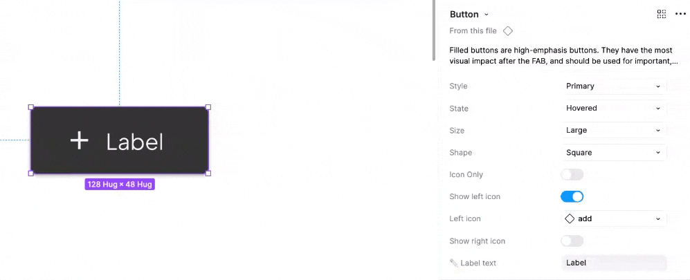
To maximize flexibility, each component was designed to support multiple states, shapes, sizes, etc. Users can easily customize elements by toggling features on or off, updating text labels, and selecting icons from a built-in library.


Each component is organized on its own dedicated page, featuring a brief overview, a copy-ready version, the master component with any nested elements, and clearly labeled state variations to ensure easy identification and seamless implementation.
User Testing
Gathering Insights to Refine the UI Library
To ensure the effectiveness of our UI library, our design team developed a structured user testing plan targeted at XD team members. The goal was to identify major pain points, uncover gaps, and gather valuable feedback to refine the system.
We structured the testing into two key parts for maximum insight. This two-pronged approach provided both qualitative and practical feedback, allowing us to iterate on the UI library with a user-centered perspective.
1. OPEN-ENDED DISCUSSION
This portion allowed participants to share their experiences, workflows, and challenges when working with design components, providing qualitative insights into their needs and pain points.
2. DASHBOARD CREATION TEST
To evaluate the practicality and flexibility of our design system, we tasked participants with building a dashboard using the UI components. This stress test helped us assess real-world usability, identify friction points, and ensure the system supported efficient design workflows.
FULL USER TESTING PLAN
User Testing Plan: Mid-Fidelity Design Library
OBJECTIVE
Evaluate the usability and effectiveness of the Mid-Fidelity Design Library to ensure seamless navigation, intuitive components, and improved efficiency in wireframing workflows before wider rollout.
KEY GOALS
-
Assess ease of navigation and component usability
-
Measure time efficiency when creating mid-fidelity wireframes
-
Determine adoption likelihood and identify any missing elements
-
Evaluate the flexibility and responsiveness of components
PARTICIPANTS
-
6 Designers (Mid, Senior, Lead, Principal, and Directors)
-
Split familiarity with Design Systems (half experienced, half less experienced)
FACILITATION TEAM
-
Facilitators: UX Designer 1, Design Systems Director
-
Notetakers: UX Designer 2, UX Designer 3
-
Additional Support:
UX Designer 4
MATERIALS & SETUP
-
Testing script
-
Microsoft Teams (with recording permissions)
-
Feedback collection via email or Teams channel
TIMELINE & REPORTING
-
Test Date: TBD
-
Results Sharing: Findings to be compiled and shared post-session
TEST PROCESS
1
Open-ended questions to understand current design workflows
2
Task: Create a dashboard using the Design Library
User Testing Insights & Action Items
Identifying Key Pain Points and Optimizing the UI Library for Enhanced Usability and Efficiency
Although I was not directly involved in conducting the user testing sessions, my team successfully executed the testing plan to gather valuable insights. They interviewed five designers, uncovering key patterns and recurring themes that highlighted opportunities for improvement and future iterations.
The feedback gathered provided a clear direction for refining the UI library, ensuring it better aligned with real-world workflows and user needs. These insights will play a crucial role in shaping the next phase of development, driving enhancements that improve usability, efficiency, and overall design consistency.
KEY PAIN POINTS
Flexibility &
Import Issues
Users encountered difficulties adjusting elements and importing components efficiently.
Component Clarity & Overload
Some users found component choices overwhelming, while others needed clearer distinctions between elements.
Template & Standardization Needs
Users requested practical examples of component usage within templates and a more standardized approach across projects.
Design System Familiarity & QA
Many users noted inconsistencies in design systems across clients, as well as gaps in QA processes.
HELPFUL TAKEAWAYS
Users appreciated easy-to-find components and the flexibility of certain components.
There was strong interest in further exploring the design library for new projects.
ACTION PLAN & NEXT STEPS
To improve adoption and efficiency of the UI design system, the team will focus on five key areas:
-
Establish a Teams governance channel to centralize feedback and foster ongoing collaboration.
-
Provide clear resources, guidelines, and tutorials to help users navigate and integrate the design library effectively.
1
Governance & Support
-
Address usability issues identified during testing.
-
Ensure seamless component importing.
-
Introduce critical additions such as a top navigation component.
-
Provide real-world template examples to demonstrate practical use and reduce ambiguity.
2
Usability & Component Enhancements
-
Develop a standardized design system structure that can scale across clients.
-
Refine component offerings to reduce choice overload and promote consistency in UI patterns.
3
Standardization & Streamlining
-
Improve QA ticketing and review processes to maintain quality and consistency.
-
Launch a loop site for ongoing maintenance, issue tracking, and requests.
-
Form working groups and assign points of contact to ensure the system evolves with user needs.
4
QA & Maintenance
-
Support incremental expansion of the library with new components and templates.
-
Encourage wider XD team participation to drive adoption and continuous improvement.
5
Expansion
This initiative establishes the foundation for a scalable, user-friendly, and brand-consistent design system. Future steps include expanding the library, encouraging broader team involvement, and continuously iterating based on user feedback.
Key Learnings & Future Considerations
Reflecting on Progress and Shaping the Ongoing Evolution of the UI Design System
While I wasn't able to conduct user testing or see the product through to launch, I’m incredibly proud of the work my team and I accomplished. Despite tight timelines and competing workloads, we successfully built an extensive design system that lays a strong foundation for consistency and efficiency. I am excited to see how this system is adopted by the larger team and leveraged in client projects.
Moving forward, the team will need to continuously iterate on existing components and expand the library to address any gaps identified through real-world use. Establishing a governance framework will be essential to ensure the system evolves in response to user needs, maintaining both scalability and usability. The true measure of success will come when designers integrate the system into their workflows—providing insights into its impact on efficiency, usability, and project turnaround time.
This experience provided invaluable hands-on learning in design system creation from the ground up. I deepened my expertise in Figma, sharpening both my technical skills and strategic thinking.
From the start, our focus was on the end-user, ensuring that they had a flexible, intuitive toolkit to design confidently and efficiently. As active users ourselves, we were able to continuously test and refine components in real time, allowing early feedback to shape our design decisions. Moving forward, maintaining a strong feedback loop with end-users will be crucial in ensuring that the system remains a valuable, evolving resource.